
...
La combinazione e la scelta dei font è un'arte. I font non sono facili da gestire e da scegliere, ma una volta individuati quelli giusti, saranno di vitale importanza per qualsiasi grafica, ma se ben gestiti possono diventare l'elemento più potente nel progetto!...
E' vero che la bellezza della tipografia sta nelle sue infinite opzioni, variazioni e combinazioni e la sua natura colossale non conosce confini ed è come ancora un'altra galassia là fuori in attesa di essere esplorata. Tuttavia, anche se la tipografia è un territorio aperto ed immenso, è sempre bene conoscere le basi per rendere un logo, un'interfaccia web o un pack dei buoni progetti.
...
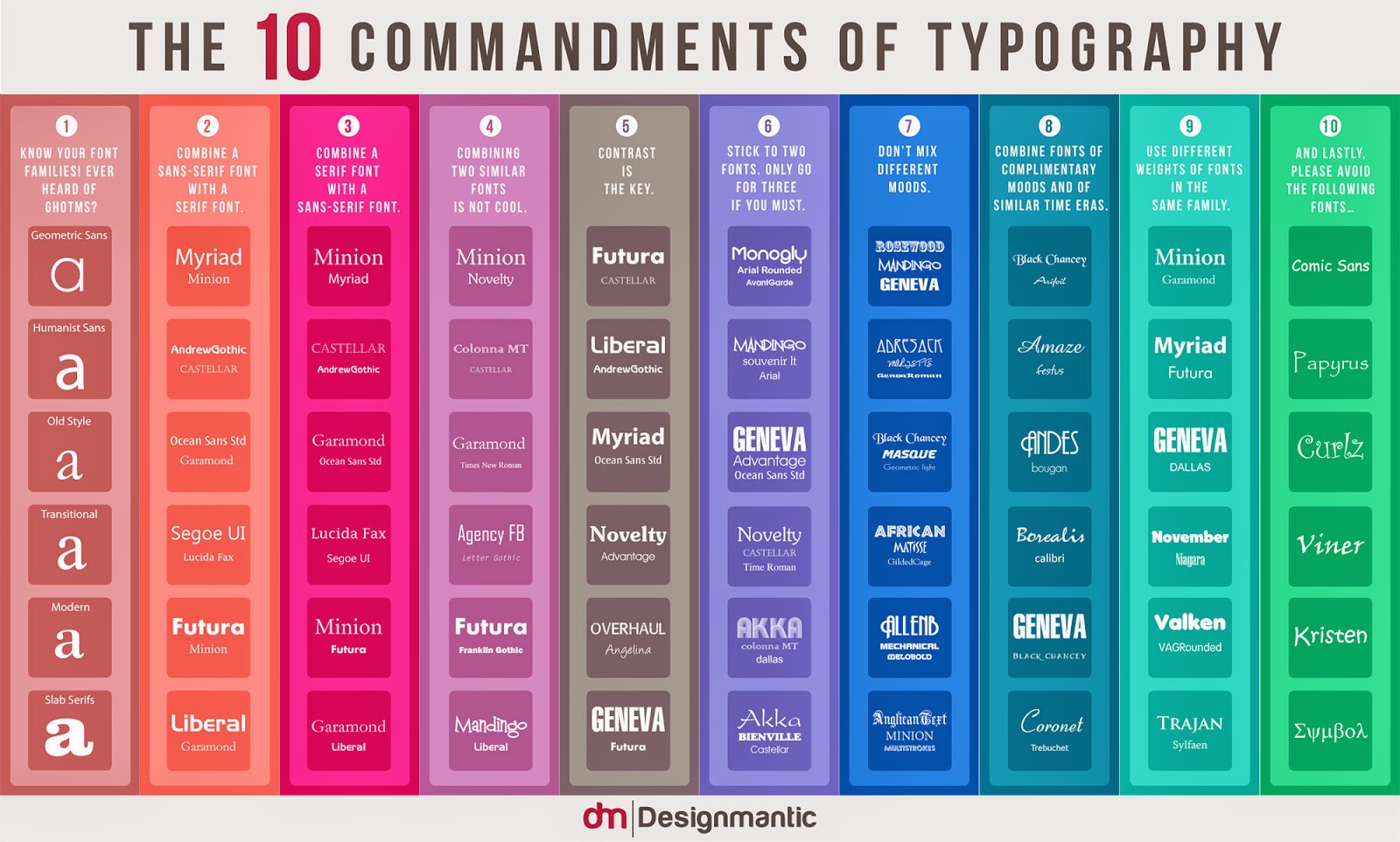
L' infografica qui sotto illustra i " 10 comandamenti di Typography " che potrebbero essere seguiti come le basi quando si tratta di scegliere i font. Anche se la tipografia è un'arte e l'arte dovrebbe essere personale con i parametri minimi, queste regole possono ancora essere applicate in modo da risparmiare tempo e troppa sperimentazione! Considerate le 10 affermazioni seguenti, come le migliori regole di tipografia ...
Combining and choosing fonts is an art. Fonts do not come easy, but
once you pull off the right typeface, it can make your graphics stand
out and, who knows, that type may even come out as the most powerful
element in your design!
...
It is true that the beauty of typography lies in its endless options, convenient variations and its colossal nature and that typography knows no boundaries and it’s like yet another galaxy out there waiting to be explored and known. However, even though, typography is open ended and vast with a lot of creativity to it, there is only so much one can do and apply. Hence, it is always good to know the tips to make unique logo design, web interface or packaging, in order to save yourself from the trouble of experimenting too many fonts on your design.
...
The infographic below illustrates the, “10 Commandments of Typography” that could be followed as quite the basics when it comes to selecting fonts. Even though typography is an art and art is supposed to be subjective with minimal parameters, these rules can still be applied in order to save time and too much experimentation! Consider the following 10 statements as the best practices of typography…
...
It is true that the beauty of typography lies in its endless options, convenient variations and its colossal nature and that typography knows no boundaries and it’s like yet another galaxy out there waiting to be explored and known. However, even though, typography is open ended and vast with a lot of creativity to it, there is only so much one can do and apply. Hence, it is always good to know the tips to make unique logo design, web interface or packaging, in order to save yourself from the trouble of experimenting too many fonts on your design.
...
The infographic below illustrates the, “10 Commandments of Typography” that could be followed as quite the basics when it comes to selecting fonts. Even though typography is an art and art is supposed to be subjective with minimal parameters, these rules can still be applied in order to save time and too much experimentation! Consider the following 10 statements as the best practices of typography…


