lunedì 5 maggio 2014

Nuovi acquisti - New shopping

La carta non è mai abbastanza! Ultimi acquisti irresistibili per la mia libreria "tecnica"


Made in Paper / Versione italiana | Kirigami - the art of cutting & folding paper - Ho Huu An + Laurence Arnac / Creazioni di Carta - Christine Leech


The paper is never enough! Latest irresistible shopping to my "technique" library 

giovedì 24 aprile 2014

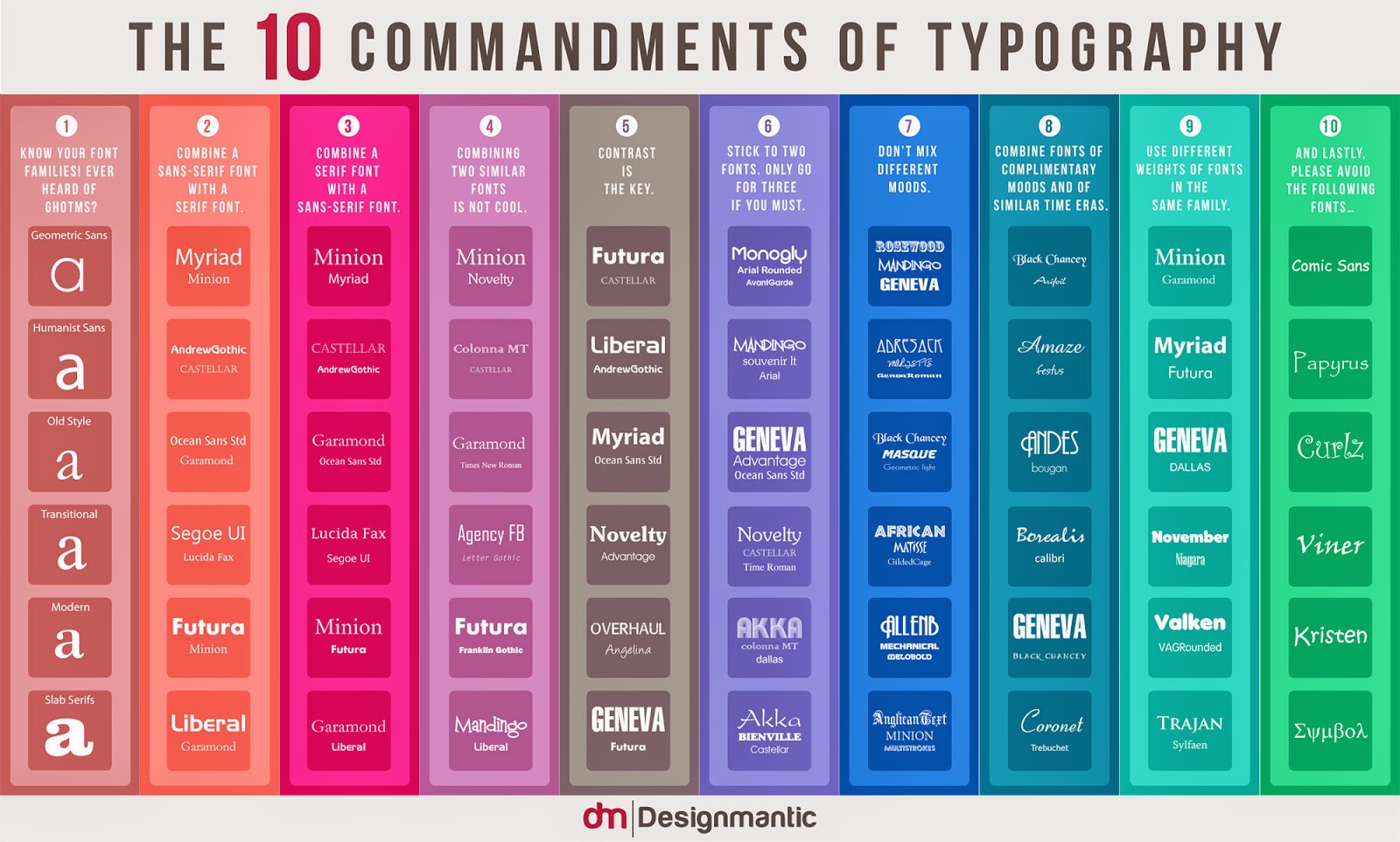
From DesignMantic [INFOGRAPHIC]: The 10 Commandments of Typography

Direttamente da DesignMantic un'infografica da tenere sempre a portata di "progetto". Direi quasi un capitolo della Bibbia del Grafico!

...
La combinazione e la scelta dei font è un'arte. I font non sono facili da gestire e da scegliere, ma una volta individuati quelli giusti, saranno di vitale importanza per qualsiasi grafica, ma se ben gestiti possono diventare l'elemento più potente nel progetto!...
E' vero che la bellezza della tipografia sta nelle sue infinite opzioni, variazioni e combinazioni e la sua natura colossale non conosce confini ed è come ancora un'altra galassia là fuori in attesa di essere esplorata. Tuttavia, anche se la tipografia è un territorio aperto ed immenso, è sempre bene conoscere le basi per rendere un logo, un'interfaccia web o un pack dei buoni progetti.
...
L' infografica qui sotto illustra i " 10 comandamenti di Typography " che potrebbero essere seguiti come le basi quando si tratta di scegliere i font. Anche se la tipografia è un'arte e l'arte dovrebbe essere personale con i parametri minimi, queste regole possono ancora essere applicate in modo da risparmiare tempo e troppa sperimentazione! Considerate le 10 affermazioni seguenti, come le migliori regole di tipografia ...

http://www.designmantic.com/blog/infographics/ten-commandments-of-typography/


Combining and choosing fonts is an art. Fonts do not come easy, but once you pull off the right typeface, it can make your graphics stand out and, who knows, that type may even come out as the most powerful element in your design!
...
It is true that the beauty of typography lies in its endless options, convenient variations and its colossal nature and that typography knows no boundaries and it’s like yet another galaxy out there waiting to be explored and known. However, even though, typography is open ended and vast with a lot of creativity to it, there is only so much one can do and apply. Hence, it is always good to know the tips to make unique logo design, web interface or packaging, in order to save yourself from the trouble of experimenting too many fonts on your design.
...
The infographic below illustrates the, “10 Commandments of Typography” that could be followed as quite the basics when it comes to selecting fonts. Even though typography is an art and art is supposed to be subjective with minimal parameters, these rules can still be applied in order to save time and too much experimentation! Consider the following 10 statements as the best practices of typography…

giovedì 2 gennaio 2014

Logo Design 2

Creare un logo è tanto bello quanto difficile! Riuscire a condensare in pochi elementi tutto un racconto... ma quando riesce è perfetto!
Bisogna fare molte prove e lavorare bene...

Project for Logotype

Questo logotipo è stato progettato e realizzato per un brand di bijoux molto femminili ed eleganti, quindi andava fatto con molta cura! Il logo di Miettes® è stato registrato, è ufficiale! Wow!


Creating a logo is as beautiful as hard! Managing to condense into a few elements around a story ... but when it succeeds it is perfect!
you must to do a lot of trials and work well ...
This logo was designed and created for a brand of bijoux very feminine and elegant, so it had to be done with great care!
The logo of Miettes® has been registered, it's official! Wow!

domenica 22 dicembre 2013

Design for Furoshiki

Cos'è il Furoshiki? Il furoshiki è una tecnica che viene dal Giappone e consiste nel realizzare vari tipi di oggetti, complementi di arredo o di abbigliamento semplicemente con un un quadrato di stoffa.
L’arte giapponese di avvolgere contenere, trasportare oggetti di ogni forma: un’alternativa elegante ed ecologica per preparare originali pacchi dono.
È un oggetto che dimostra la raffinatezza e il gusto estetico così sviluppati della cultura giapponese. Scegliere e annodare un furoshiki è diventata un’arte che si tramanda di generazione in generazione.

Ambasciatrice in Italia di quest'antica e raffinatissima arte è Barbara Perrone che è ormai un punto di riferimento per workshop e info per il Furoshiki. Il progetto di Barbara è quello di applicare il furoshiki in modo trasversale, facendolo uscire dai confini di packaging ecologico e trasformista e facendolo diventare anche altro.
Ad esempio abiti! (Toga party / FunForFashion)
Ma questa volta oltre al furoshiki c'è di più! C'è lo zampino di Paper Leaf Design che ha curato la grafica per questo nuovo progetto!
Panettone Furoshiki, in collaborazione con Barbara Perrone e La Taste


Photo courtesy - Davide Tiezzi

venerdì 13 dicembre 2013

Sans Serif Font | My preferite

E dopo i font serif ecco una piccola raccolta di font (free) Sans Serif.
Sans Serif è una denominazione usata nei paesi anglosassoni per i caratteri lineari, ma viene dalla lingua francese e significa senza "serif", cioè senza grazie. In Italiano vengono anche chiamati caratteri "a bastoni".


After serif collection, here you are a small collection of (free) Sans Serif fonts.
Sans Serif is a designation used for characters in
Anglophone countries, but it comes from the French language and means "without serif". In Italian they are also called "a stick".
 

venerdì 29 novembre 2013

Logo Design

Il logo è la faccia di un brand. Deve comunicare subito chi sei, deve raccontare cosa fai e come lo fai.
Progettare un logo ed il naming da zero è fantastico, ma a volte esiste già ed è necessario un rebranding totale o parziale. Altre volte vanno mantenute alcune caratteristiche come i colori o le font. Non è sempre facile ma le sfide sono comunque interessanti!
Il logo di Rory's Bijoux aveva bisogno di un lifting per renderlo più fresco ed attuale, era necessario lisciare le sue piume di pavone! ;)


The logo is the look of a brand. It musts immediately tell who you are, what you do and how you do it.
Designing a logo and naming from scratch is great, but sometimes it already exists and you need a total or partial
rebranding. Other times the client needs some features, such as colors or fonts, to be kept. It is not always easy, but the challenges are still interesting!
The logo of Rory's Bijoux needed a facelift to make it more fresh and new, it was necessary to smooth its peacock feathers!

mercoledì 20 novembre 2013

Retail Identity for bijoux

Anche il regalo più bello deve avere una confezione alla sua altezza! E se si creano bijoux la presentazione deve essere impeccabile per far risaltare ancor di più la bellezza degli oggetti.
Spesso si commette l'errore di considerare come inutile o di poco conto l'aspetto esteriore delle confezioni.
Nulla di più sbagliato! Una buona immagine di se è il miglior mezzo per farsi ricordare.
E se avete voglia di affidare la vostra immagine ad un professionista, non avete che da chiedere!
Questi sono alcuni dei progetti che ho sviluppato per i materiali di vendita per bijoux, presto disponibili sul mio Blomming Shop.

Retail Identity | La fringuella innamorata | earrings card, business card, ring card and tags

Retail Identity | Bird Cage | earrings card in two format, business card and tags

Retail Identity | Chandelier Mon Amour | earrings card in two format, business card and tags

Retail Identity | Bird Cage | earrings card in two format, business card, ring card and tags

Even the most beautiful gift must have a packaged as it deserves! And if you create bijoux your presentation has to be perfect to magnify it. We often make the mistake of thinking about packaging as useless.
Nothing could be more wrong! A good presentation is the best way to be remembered.
And if you want to entrust your branding to a professional, all you have to do is just to ask me!
 
These are some of the projects that I have developed for marketing materials for jewelry, available soon on my Blomming Shop.

sabato 19 ottobre 2013

Blomming shop

Avete bisogno di un logo? Dell'immagine coordinata per il vostro brand? O volete fare un regalo calligrafico? Lo shop on line di Paper Leaf Design è a vostra disposizione!


Powered by Blomming for Paper Leaf Design
Need a logo? Corporate image for your brand? Or do you want a calligraphic gift? The online shop Paper Leaf Design is at your disposal!

domenica 15 settembre 2013

Serif shop signs | Around Rome

Una passeggiata al centro di Roma regala sempre piacevoli sorprese... tipografiche! Vecchie insegne che ricordano la Dolce Vita!


A walk in the heart of Rome always gives pleasant surprises ... typography! Old signs that reminding La Dolce Vita!

lunedì 19 agosto 2013

Logos & coffe

Qualche tempo fa mi è stato chiesto di sviluppare il concept del logotipo per un bar. Il punto vendita stava facendo un restyling totale e anche il logo aveva bisogno di una rivisitazione.
Il brief era un po' strano: il cliente voleva puntare tutto su due colori (rosso cupo e marrone chiaro), su "qualcosa di diviso in due" e il numero 3. Molto strano! o.O
Ma qualcosa di buono si crea sempre!


Some time ago I was asked to develop the concept of the logo for a coffeshop. The store was doing a total makeover and the logo needed a revision.
The brief was a bit strange: the client asked for a two colors logo (dark red and light brown), "something split into two" (???) and the number 3. Very strange!
o.O
But it always creates something good!

mercoledì 10 luglio 2013

Serif Font | My Favorite

Da Wikipedia: Caratteri tipografici con grazie"Ci si riferisce a caratteri tipografici con grazie (in inglese serif fonts) quali caratteri tipografici che possiedono alle estremità degli allungamenti ortogonali, detti per l'appunto grazie."

Questi di seguito, sono alcuni dei miei font serif preferiti. Tutti free!
Perfetti per brevi frasi, titoli e logotipi.

Combustion Wide by Ænigma | Ayres by MAGOfonts | Euphorigenic by Typodermic fonts | Otama e.p. by Tim Donaldson | Chiper by Todd Bushman | Covington by Apostrophic Labs

From Wikipedia: Serif
In typography, a serif /ˈsɛrɪf/ is a small line attached to the end of a stroke in a letter or symbol, such as when handwriting is separated into distinct units for a typewriter or typsetter. A typeface with serifs is called a serif typeface (or serifed typeface). A typeface without serifs is called sans serif or sans-serif, from the French sans, meaning “without”. Some typography sources refer to sans-serif typefaces as "Grotesque" (in German "grotesk") or "Gothic", and serif typefaces as "Roman".

These above are some of my favorite serif font. All free!
Perfect for short quotes, titles and logos.

giovedì 6 dicembre 2012

The winter is coming: wallpaper

Non amo molto la neve, il ghiaccio e la pioggia. Soffro il freddo e il buio... insomma l'inverno non fa per me! Ma ogni tanto bisogna cambiare, almeno una volta a stagione.
Neve e bacche rosse, ma solo sul monitor.


I don't love the snow, ice and rain. I really hate cold and the dark ... in short, winter is not for me! But every so often must change something least once a season.
Snow and red berries, but only on the monitor.

venerdì 16 novembre 2012

Typography, my Love

Confesso tutto il mio amore per l'Helvetica Neue. Più esattamente per l'Helvetica Neue Extended. Confesso il mio odio più totale ed assoluto per il comic sans (che, come tutti sanno, non è neanche un font).

Buona parte di un progetto grafico dipende dalla scelta del font e spesso - troppo spesso - questo aspetto non viene preso in considerazione, con risultati decisamente spaventosi. Il mondo della tipografia è vasto, interessantissimo ed a volte misterioso, ha le sue regole ed i suoi adepti, i suoi ritmi e le sue storie. Sarà per vecchiaia, per nostalgia dei "bei tempi quando si faceva tutto a mano", sarà che c'era una qualità diversa dal "tanto al chilo" di questi tempi, ma i font disegnati nella prima metà del vecchio secolo si riconoscono a colpo d'occhio.
Una delle principali applicazioni, oltre la carta stampata, erano le insegne dei negozi. Un patrimonio grafico che sta scomparendo con la progressiva chiusura dei piccoli negozi a favore di supermercati e jeanserie senz'anima e senza storia.
Un patrimonio grafico ed artiginale che è un vero peccato perdere senza fare nulla. Per questa ragione mi sono armata di macchinetta fotografica ed ho iniziato a girare per il centro della città in cerca di vecchie insegne. Inizio a condividere qualche "reperto" grafico scovato in giro. E nella vostra città? Ci sono vecchie insegne da salvare? Allora fatelo!

Coiffeur - Via del Boschetto | Parrucchiere, via Torino

I admit all my love for Helvetica Neue. More precisely, for the Helvetica Neue Extended. I declare my total and absolute hate for Comic Sans (which, as everybody knows, is not even a font).

Large part of graphic design depends on the choice of font and often - too often - this aspect is not taken into account, with disastrous results. The world of typography is vaste, interesting and sometimes mysterious, it has its own rules and its adepts, its rhythms and its stories. Perhaps it is the old age, nostalgia for the "good old days when everything was done by hand," is that there was a different quality from "so much per kilo" these days, but the fonts drawn in the first half of 1900 can be recognized without of an eye.

One of the main applications, as well as the press, were the shop signs. A graphic heritage that is disappearing with the progressive closure of small shops for the benefit of supermarkets and jeans soulless and without history.
A graphic and handicraft heritage which is a real shame to lose without doing anything. For this reason I took the camera, and I started to run to the center of the city in search of old signs. Beginning to share some "finding" graphic discovered around. And in your city? There are old signs to be saved? Then do it!


Ristorante Alfredo - Piazza Augusto Imperatore
Siti interessanti / interesting websites:

http://ilovetypography.com/

http://welovetypography.com/


martedì 13 novembre 2012

Vintage XMas

Manca più di un mese a Natale, ma bisogna prepararsi... almeno virtualmente! Inizio con la carta digitale, perfetta per sfondi, stampa digitale e progetti di scrapbooking natalizi con un pizzico di aria vintage. Disponibile QUI sul Blomming e-shop.


Christmas is in a month, but we must prepare ... at least virtually! Beginning with the digital paper, perfect for backgrounds, digital printing and scrapbooking projects with a pinch of vintage Christmas. Available HERE on Blomming e-shop.

domenica 11 novembre 2012

Icone&Bottoni

Piove, il cielo è grigio e fa freddino. Niente di meglio di un po' di colore!
6 bottoni e 5 icone social in 6 colori assortiti per blog o website. Un piccolo assaggio di quello che potete trovare nello shop Blomming di Paper Leaf Design

Scarica qui:
Tutto il set completo di bottoni QUI su Blomming
Tutto il set completo di icone QUI su Blomming


It's raining, the sky is gray and is chilly. Nothing better than a bit of color!

5 and 6 buttons social icons in 6 assorted colors for your blog or website. A little taste of what you can find in Paper Leaf Design shop on
Blomming

 
Download here:
<COLOR SET>

The full set of buttons on Blomming HERE
The full set of icons
on Blomming
HERE 

lunedì 5 novembre 2012

Paper Leaf Design on Blomming!

Si iniza con poco... ma buono! Per ora loghi, ma presto arriveranno tante altre sfiziose novità, per tutti i gusti, per tutte le tasche! Il Blomming Shop di Paper Leaf Design


It begins with little... but good! Logos for now, but will soon be many more tasty news for everyone, for every budget! The Paper Leaf Design shop on-line

sabato 20 ottobre 2012

Rory'S Bijoux Rebranding

Ci sono progetti che si eseguono per professione ed altri che si fanno con il cuore. Questo appartiene alla seconda categoria.
Quando Rory mi ha chiesto di realizzare una nuova veste grafica per il suo blog e soprattutto del perchè sentiva la necessità di questo cambiamento, ho capito che insieme alla mia esperienza professionale ci sarebbe finito anche un pezzetto di cuore. E così è stato.
<Qui> per visitare il blog di Rory e le sue meravigliose creazioni in pasta polmerica


Rory's Bijoux


 There are projects that are performed as a profession and others who are from the heart. This belongs to the second category. When Rory asked me to create a new look for her blog and especially because she felt the need for this change, I realized that together with my professional experience there would have been also a piece of my heart. And so it was.
<Here> The Rory'S blog with the wonderful creations in polymer clay

venerdì 19 ottobre 2012

The autumn is coming: wallpapers

In Europa gli scoiattoli sono grigi e con la coda smilza, ma vuoi mettere con un bel roditore rosso dalla coda fluente? Fa molto più autunno lo scoiattolo targato USA!
L'autunno è arrivato, anche sul monitor! In 4 formati per tutti i gusti!


mercoledì 3 ottobre 2012

Rusty Icons

Dopo i patterns, dopo i bottoni, ecco qualche icona. Social per iniziare. In tre formati e dal colore verde rame, con una texture un po' arrugginita. Perfette per l'autunno che arriva.


6 icone social verde rame, PNG su trasparente, 3 formati. Che altro si può volere?

Scarica qui: